
How to Use Custom Reports
Visualizations
Under the filters dropdown, there is the visualization drop down menu where you can select the visualization you would like to use for your report when saving to a dashboard. Some of the options are:
Data Table
Column Graph
Bar Graph
Scatterplot
Line Graph
Area Graph
Pie Chart
Geographical Map

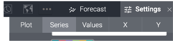
Additional options are available through the ellipses. To change colours on your visualization, this can be found in the ‘settings’ selection under the ‘series’ tab.
Data Sorting
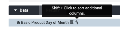
Once fields are added to the report they appear as columns. Within these columns, there are ways you can sort your report:
Descending/Ascending orders
Using the arrows beside the column names, you can sort the entire report by ascending and descending the data
Explore by selecting a name in a column to auto run